Skip to main content
MAXIMUM ROCKNROLL
Reviews
Radio
Columns
Articles
Magazine
News
FAQ
Store
About
Contact
Reviews
Radio
Columns
Articles
Magazine
News
FAQ
Store
About
Contact
News
Categories
Filter by category
Archive
Blog/Website of the Week
Columns
Comics
Interviews
News
Obituaries
Photos
Reviews
Scene Reports
Shows
Video of the Week
Search the site
Blog/Website of the Week
Maximum Rocknroll
,
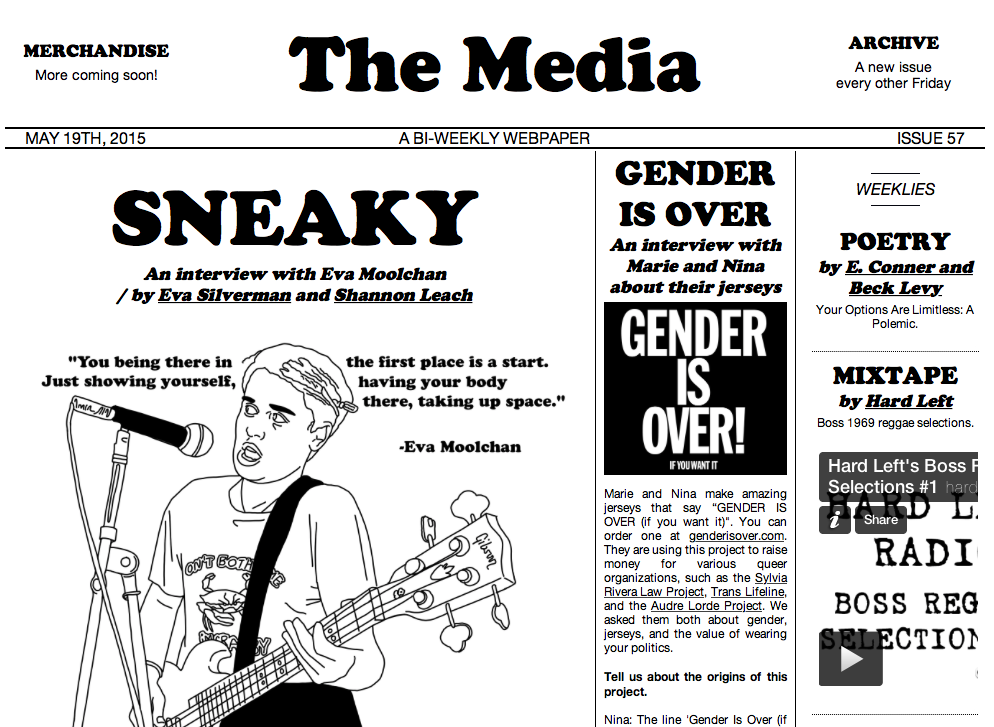
The Media
, Your Options
Published:
May 22, 2015
The Young Person’s Guide to Loud! Fast! Philly! by Stacey Finney
Published:
May 14, 2015
The Young Person’s Guide to Loud! Fast! Philly! Part 1
Published:
May 6, 2015
Blog of the Week: Raw Pussy
Published:
July 31, 2012
Blog of the Week: Total Fucker
Published:
June 27, 2012
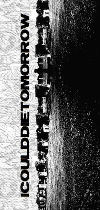
Blog of the Week: icoulddietomorrow
Published:
June 5, 2012
Blog of the Week: Thunderhorse Vintage
Published:
May 22, 2012
Blog of the Week: Jason Traeger
Published:
May 16, 2012
Come to Our Show:
a Punk Flyer eBook
Published:
January 31, 2012
Blog of the Week: Remote Outposts
Published:
January 19, 2012
Website of the Week: Occupy Together!
Published:
October 1, 2011
Blog of the Week: Radio Survivor
Published:
September 7, 2011
Blog of the Week: La Cantatrice Chauve
Published:
July 22, 2011
Website of the Week: AZ Punk Flyer Archive!
Published:
June 30, 2011
Website of the Week: Brian Walsby! (.net!)
Published:
May 11, 2011
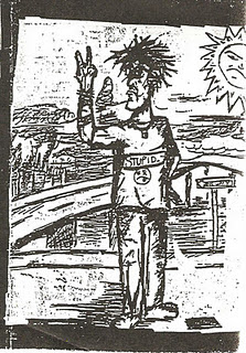
Blog of the Week: Art 4 Punks
Published:
March 16, 2011
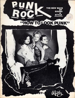
Zines is Punks
Published:
December 31, 2010
Website of the Week: Do DIY
Published:
December 17, 2010
Blog of the Week: Turkish Punk
Published:
December 3, 2010
Blog of the Week: Kill Your Pet Puppy
Published:
September 23, 2010
Blog of the Week: Grand Rapids Is Screaming
Published:
July 22, 2010
Blog of the Week: Double Cross
Published:
July 15, 2010
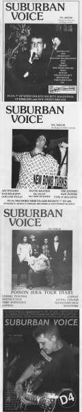
Blog of the Week: Suburban Voice and Sonic Overload
Published:
June 30, 2010
Blog of the Week: Pressure’s On
Published:
June 11, 2010
Blog de la Semana: Antipatia Zine
Published:
June 3, 2010
Blog of the Week: Terminal Escape
Published:
May 13, 2010
Blog of the Week: Borneo DIY Hardcore
Published:
May 6, 2010
Website of the Week: Alice Bag’s “Women in LA Punk”
Published:
April 30, 2010
Website of the Week: Operation Phoenix
Published:
April 22, 2010
Blog of the Week: DIY Irish Punk Archive
Published:
April 16, 2010
Blog of the Week: Threadbared
Published:
April 1, 2010