Blog of the Week: Art 4 Punks
 You can’t always judge a book by its cover, but Art 4 Punks is a record review site with a difference: ignoring the music, blogger Paul D’Elia reviews the artwork and packaging instead. He casts a critical and thoughtful eye on something that is often considered throwaway or even an afterthought by many bands and labels, and highlights those who make an effort to deliver an effective visual counterpart to the music on the record. Paul’s something of a punk rock renaissance man, having played in several bands (including Tear It Up, Dead Nation, and The Rites) and turning out a fair amount of art himself (evidence at screenin4achange.com). I took the opportunity to get some background on the Art 4 Punks blog and get his thoughts on punk cover art. —Allan
How long have you been into design and how did you get into it? Was it from a particular punk record?
I guess I got into design while I was at college. I had started out as a photo student, but I went to a very liberal art college that encouraged you to try any and every medium in order to carve out your own creative path. While I was there the whole world of photography was shifting to digital and I began to lose interest in shooting, so I started working more with screen-printing instead. The only problem was that I needed to have images to print, so I guess that was when I really started to think about building art more in the form of design. Truthfully, I was looking more to vintage poster and skateboard art for inspiration than I was punk records at the time.
Which designers or artists do you look up to (Both punk’ and non-punk)?
Raymond Pettibon is a huge one for me. I love his illustration style, and the art created for Sonic Youth’s “Goo” might be my favorite album he’s done. The skateboard art that Jim Phillips was doing in the 80’s was very important to me while I was learning about screen-printing. Beyond that, anything collage/abstract in content tends to interest me. I’ll spare you the laundry list.
Which current labels and bands do you think are putting out the best-designed product?
Youth Attack and Feral Ward are the two labels that continue to kill it for me: every release is expertly thought out and executed beyond the normal expectations of what a punk record would look like, and I can’t get enough of that. As far as bands, I’d have to say Daylight Robbery and Masshysteri both pulled together some of the most mature/best looking records of the last few years, with an honorable mention to Cola Freaks for their general flawless sense of style. It’s really hard for me to pin a few down because I really do love so much of what I see coming from bands right now… everyone is really upping their game for 2011!
A lot of bands and labels don’t spend a lot of time on graphics/artwork, like there’s something extra-punk about a throwaway aesthetic. Why do you think it’s important?
I have always been a very visual person, so for me when I am listening to a record the visual presentation is nearly as important as the audio… and that is not to say everything needs to look really slick and polished, cause it definitely doesn’t; I think it’s more about effectively creating a vehicle to help deliver the audio message regardless of the budget or available resources.
What are your five all-time favorite punk record covers, and why? And can you name a couple of great records with terrible covers?
Man, that is a really hard question! Let’s start with the good… not necessarily a “top 5” but more like a “5 really really great” covers.
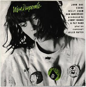
X – Adult Books 45
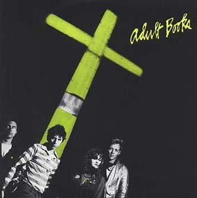

It’s a great layout all around really, but I really love the front and back cover. It’s smart without coming off too conceptual…. all the Dangerhouse releases were exceptional enough to mention visually. They really had their finger on the pulse of what was happening on an artistic level in punk at the time…
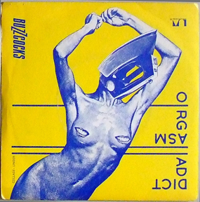
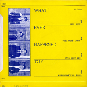
Buzzcocks – Orgasm Addict 45
I’ve loved this record for so many years and I still don’t know which side of the art is up! The beauty of this graphic mystery is that it really doesn’t matter because it looks amazing no matter how you are holding it. AND the back cover is just as beautiful and confusing… it’s the ultimate “punk meets hi-art” example, and it will always be a top cover for me.
Discharge – Realities of War EP
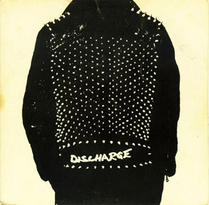
A simple photo turned punk phenomenon… when I think of “punk” looking records, this is what comes to mind (well, this and Hear Nothing…) the simplicity is so striking, sometimes less is more ya know?
Void – Faith/Void split 12″
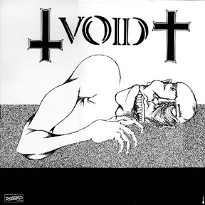
The color breakup between the black and white on this cover continues to be one of the most creative and sophisticated uses of negative space ever to grace a punk record. The black bar on the bottom creates a really nice balance for the illustration in the center and then the bold type on the top. Without it, it would have just been an illustration, not a composition.
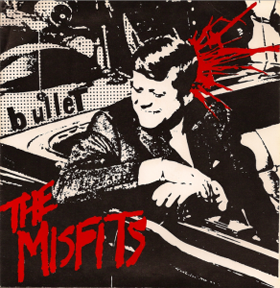
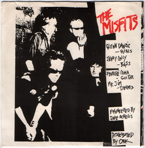
The Misfits – Bullet EP
This cover is pop-culture misappropriation at it’s finest. You take an image everybody knows and arguably feels something about when they see it, photocopy it to oblivion, and then add a touch of red for effect. We all know Kennedy was shot in the head, yet this cover is still shocking the first time you see it. It’s gritty and raw, yet oozing with style. Black. White. Red. This record is king.
As for the bad, there are a lot that come to mind… pretty much any ALL or Descendents record would fall in that category. Both those bands have catalogs full of music I adore and cover art I can’t relate to. I love the Big Boys, but there is a bit of a cringe factor to the Lullabies Help the Brain Grow cover art. Richard Hell and the Voidoids, or any other early 80’s band that just phoned it in with a mediocre photo of themselves and then slapped some Helvetica over top… Really though, there is way more that I am just indifferent to, and I don’t know if that’s better or worse.

